Terrific post by Colin Robertson at TheTruthAboutMortgage.com
Use This Mortgage Payment Chart to Easily Compare Rates
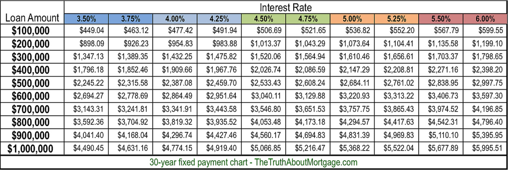
Now that mortgage rates have gone absolutely haywire, I decided it would be prudent (and helpful) to create a “mortgage payment chart” that details the difference in monthly payment across a variety of interest rates.
So if you were quoted a rate of 3.5% on your 30-year fixed mortgage two weeks ago, but have now been told the rate is closer to 4%, you can see what the difference in monthly payment might be, depending on your loan amount.
Click to enlarge
My first chart highlights monthly payments at different rates for 30-year mortgages, with loan amounts ranging from $100,000 to $1 million.
I went with a bottom of 3.5%, seeing that mortgage rates were around that level about a month ago, and probably won’t return there (EVER).
However, there is the possibility that rates could drift back in that direction. And one might be able to buy their rate down to around that price, assuming they want an even lower rate.
For the high-end, I set interest rates at 6%, which is where 30-year fixed mortgage rates were for many years leading up to the mortgage crisis. With any luck they won’t return there anytime soon…
Of course, they could rise even higher over time, but hopefully rates won’t climb back to the double-digits last seen in February 1990.
That fear aside, this mortgage payment chart should give you a quick idea of the difference in payment across a range of interest rates and loan amounts, which should save some time fooling around with amortgage calculator.
Below is a mortgage payment chart for 15-year fixed mortgages, which are also quite popular. I used a floor of 3% and a max rate of 5.50%. Again, rates can and will probably climb higher, just hopefully not anytime soon.
Click to enlarge
For the record, you can obtain mortgage rates at every eighth of a percent, so it’s also possible to get a rate of 3.625%, 3.875%, 4.125%, 4.375%, and so on.
Tip: The lower the interest rate, the smaller the difference in monthly payment. As rates move higher, the difference in payment becomes more substantial.
On a $500,000 loan amount, the monthly payment difference between a rate of 3.5% and 3.75% is $70.36, compared to a difference of $77.93 for a rate of 5.25% vs. 5.5%.
Additionally, higher mortgage rates are more damaging to larger loan amounts. If you look at the 30-year chart, the payment on a $400,000 loan amount at 3.50% is cheaper than the payment on a $300,000 loan at 6%.
Lastly, note that my mortgage payment graph only lists the principal and interest portion of the mortgage payment. You may also be subject to paying mortgage insurance and/or impounds each month. Property taxes and homeowner’s insurance are also NOT included.
You’ll probably look at this chart and say, “Hey, I can get a much bigger mortgage than I thought.” But beware, once all the other costs are factored in, your DTI ratio will probably come under attack, so tread cautiously.

